
Zefina Art • Music Wall Decor
Drake Posters for Room: Creative Ways to Style Your Space
Practical wall decor ideas for bedrooms, dorm rooms, gaming setups and music corners, inspired by Drake album artwork.
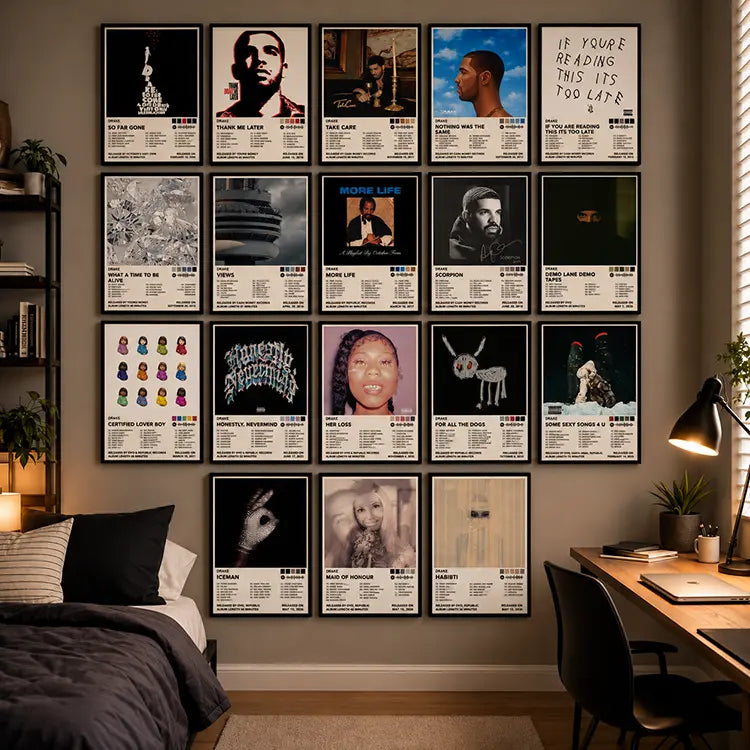
Turn Your Blank Wall Into a Music Statement
A blank wall above your bed is a strange kind of opportunity. It sits there, waiting for something that actually says who you are. For a lot of people, that something involves music, and few artists have a visual catalog as recognizable as Drake.
Drake posters for room decor solve a common problem. They fill empty wall space with color and personality, and they immediately signal what kind of music shapes your world. You do not need new furniture or a full redesign to change how a room feels. A wall of album artwork can do it.
This guide covers practical ways to use Drake album cover posters in bedrooms, dorms, apartments, and music corners. You will find layout ideas, color guidance, and arrangement strategies that work in real rooms.
Why Drake Wall Art Works So Well in Room Decor
Music-inspired interior design has become one of the easiest ways to personalize a space. Album artwork gives you a focal point without requiring expensive changes.
Drake's catalog is especially suited for this because the visual style shifts dramatically from project to project. The muted, cinematic tones of Take Care sit in a different visual world from the emoji-forward minimalism of Certified Lover Boy. That variety gives you options.
You can build a wall that feels warm and nostalgic, or one that reads clean and modern. You can lean into a single era or tell a broader story. The artwork carries the visual weight, so the rest of the room does not need to compete.
The other practical advantage is scale. Album cover prints are compact enough for small bedrooms and dorm rooms. When grouped together, they create enough visual weight to anchor a larger wall. That flexibility helps in spaces where furniture options are limited.
Choosing the Right Drake Album Cover Posters
Not every album cover works the same way in a room. Thinking about color and mood before you buy can save you from a wall that feels disjointed.
Take Care
Take Care has a warm, autumnal palette with rich golds and browns. It reads as cozy and reflective, which suits a bedroom with wood tones or warm lighting.
Nothing Was the Same
Nothing Was the Same uses a blue-sky backdrop with illustrated figures. The blue tones feel open and airy, which can brighten a wall that does not get much natural light.
Views leans into a cold, atmospheric Toronto aesthetic with the CN Tower as its focal point. If your room already
Views leans into a cold, atmospheric Toronto aesthetic with the CN Tower as its focal point. If your room already has gray, white, or black elements, this cover fits easily.
Scorpion
Scorpion is stark black and white. It works almost like a graphic design piece, which makes it useful for breaking up a wall of colorful covers or adding contrast to a minimal space.
Certified Lover Boy
Certified Lover Boy is bright white with colorful emoji figures. It brings a pop-art energy that works in playful, colorful rooms or as an accent among darker covers.
For All the Dogs features a childlike drawing with bold black, white, and red. It
For All the Dogs features a childlike drawing with bold black, white, and red. It has a raw, sketchbook quality that adds variety to a wall that might otherwise feel too uniform.
When selecting which covers to display, start with the colors already in your room. Pick two or three albums that share a tone, then add one that contrasts. That contrast keeps the wall from feeling flat.
Creative Drake Room Decor Ideas for Different Spaces
Minimalist Bedrooms
In a minimalist room, fewer posters often work better than a full set. Choose two or three covers with restrained palettes. Scorpion and Views both work here because they rely on black, white, and gray. Mount them in simple black frames with generous space between them. The negative space becomes part of the design.
Modern Apartments
Apartments often have open floor plans and neutral walls. A grid of six to nine covers creates a structured focal point without overwhelming the room. Stick to one row height and even spacing. This approach reads as intentional and gallery-like, which suits a cleaner aesthetic.
College Dorm Rooms
Dorm walls are usually small and covered in cinder block or painted drywall. A full set of smaller prints arranged in a tight grid makes the most of limited space. Because dorm rooms often have basic furniture, the poster wall becomes the main visual feature. This is where a complete album collection works especially well.
Cozy Music Corners
If you have a chair, a record player, or a small listening setup, treat that area as its own zone. Stack three or four album covers vertically above the turntable or beside the chair. Warm-toned covers like Take Care fit this mood. Add a small lamp nearby to create layered lighting that makes the corner feel intentional.
Gaming Rooms
Gaming setups often have dark walls and RGB lighting. Posters with high contrast, like Scorpion or Certified Lover Boy, stand out well against dark backgrounds. You can align the poster wall with the monitor or desk to create a cohesive tech-and-music zone.
Small Bedrooms
In tight spaces, go vertical instead of horizontal. A single column of four to six covers takes up less wall width than a wide grid. Place it beside the bed or above a dresser. This arrangement draws the eye upward and can make a small room feel taller.
How to Create a Drake Poster Wall Collage
A collage looks effortless when it is actually planned. Here is a process that works.
Step 1: Decide on a shape
Before you hang anything, choose whether you want a rectangle, a square, or an organic arrangement. A rectangle grid is the most forgiving for beginners because the edges align naturally.
Step 2: Lay it out on the floor
Place all your posters on the floor in the arrangement you are considering. This lets you see the color balance and adjust before anything touches the wall. Take a photo from above so you have a reference.
Step 3: Measure your spacing
Consistent gaps between posters make the wall feel organized. A two-inch gap is a common choice for 8 by 12 inch prints. Use a ruler or a piece of cardboard cut to the right width as a spacer.
Step 4: Start from the center
Mark the center point of your wall and build outward. This keeps the arrangement balanced even if the wall is not perfectly symmetrical.
Step 5: Use removable adhesive if you rent
Command strips and similar products let you rearrange without damaging paint or drywall. They are especially useful in dorms and apartments where you cannot make permanent changes.
Step 6: Step back and adjust
After the first few posters are up, step back and look from a distance. Adjust spacing or swap covers before committing to the full layout.

Drake Wall Art Ideas for Different Room Aesthetics
Minimalist Aesthetic
Stick to black and white covers. Scorpion is the obvious anchor. Add Views for its cool gray tones. Use thin black frames and leave plenty of white wall space around the group.
Dark and Moody Aesthetic
Lean into deep colors and high contrast. Take Care brings warm darkness. For All the Dogs adds stark black and red. Pair with dark bedding and warm, low lighting.
Neutral and Modern Aesthetic
Choose covers with blue, white, and soft gray tones. Nothing Was the Same and Views work together here. Keep frames simple and let the artwork provide the only color.
Vintage-Inspired Aesthetic
Take Care has an almost painterly quality that suits a vintage look. Pair it with warm wood furniture and soft textiles. Mix in a thrifted frame for a collected feel.
Colorful Music Gallery Wall
Use the full range of covers. Certified Lover Boy brings bright white and color. Nothing Was the Same adds blue. Take Care adds gold and brown. Arrange them so no two similar tones sit directly next to each other.
Where to Place Drake Posters for Bedroom Walls
How to Style Drake Music Posters Without Making Your Room Look Cluttered
Use consistent spacing
Uneven gaps are the fastest way to make a poster wall look messy. Pick a gap size and stick to it throughout the arrangement.
Limit your color palette
If your room already has strong colors, choose posters that share those tones. If your room is neutral, you have more freedom, but three to four dominant colors is usually enough.
Mix framed and unframed intentionally
An all-framed wall looks formal. An all-unframed wall looks casual. Mixing a few frames into an unframed group can add texture, but keep the mix deliberate rather than random.
Leave negative space
Not every inch of wall needs to be covered. Leaving space around the poster group makes the arrangement feel like a curated feature instead of wallpaper.
Choose one focal point
If your posters are the main visual element, keep other wall decor minimal. If you already have a large piece of art, treat the posters as a supporting element rather than a competing one.
Choosing Between Individual Drake Album Posters and Full Sets
Individual posters give you complete control over which albums you display. If you only want three or four covers from specific eras, buying individually makes sense. It is also useful if you want to mix sizes or add covers from other artists later.
A full album poster set is better if you want the complete visual story. Sets usually include covers from across the artist's career, which makes it easier to create a cohesive wall without hunting down individual prints. Sets also tend to be more cost-effective per poster than buying separately.
The right choice depends on your wall size, your budget, and whether you already have a clear vision for the layout. If you are starting from scratch, a set gives you more material to work with. If you are adding to an existing collection, individual posters let you fill specific gaps.
Where to Find Drake Album Cover Wall Art
Zefina Art offers a Drake album cover poster collection that includes 18 unframed prints sized at 8 by 12 inches on premium 200 GSM cardstock. The set is designed for gallery walls and individual display, and the prints arrive ready for your own frames or mounting setup.
If you are building a music-inspired wall and want a complete starting point, this collection gives you enough covers to create a full arrangement without sourcing each print separately.
Simple Tips to Keep Your Poster Wall Looking Great
Avoid direct sunlight
Prolonged sun exposure can fade printed colors over time. If your wall gets strong afternoon light, consider frames with UV-filtering glass or reposition the arrangement to a less exposed wall.
Keep prints away from moisture
Bathrooms and kitchens are not ideal locations for paper posters. Humidity can cause warping and damage over time.
Use the right mounting materials
Removable adhesive strips work well for unframed prints. For framed pieces, use proper picture hooks rated for the weight. Avoid tape directly on the paper.
Clean framed posters carefully
Dust the frame with a dry cloth. If the glass needs cleaning, spray the cloth rather than the glass to avoid liquid seeping behind the frame.
Rearrange without damaging walls
If you like to change your layout, use removable adhesive and mark the original hook positions with a pencil so you can return to them later.
Create Your Drake-Inspired Music Wall
Explore the Drake album cover poster collection and start arranging a wall that feels personal, balanced and unmistakably yours.
Shop Drake Album Cover PostersFrequently Asked Questions
How do I decorate my room with Drake posters?
Start by choosing a focal wall, usually above your bed or desk. Arrange three to six covers in a grid, or use a full set for a larger gallery wall. Keep spacing consistent and let the artwork provide the color.
Which Drake album covers look best as wall art?
Covers with strong graphic elements work well. Scorpion has high-contrast black and white. Views uses cold blue tones. Certified Lover Boy brings bright white and color. The best choice depends on your room's existing palette.
How many Drake posters should I put on one wall?
For a small wall, three to six posters is usually enough. For a larger feature wall, nine to eighteen covers can work if you use a structured grid. The key is to leave negative space around the group.
What is the best way to arrange Drake album posters?
A centered grid is the most reliable arrangement. Lay the posters on the floor first to test the layout. Use consistent gaps, start from the center of the wall, and build outward.
Can Drake posters work in a minimalist bedroom?
Yes. Choose two or three covers with restrained palettes, like Scorpion and Views. Use simple frames and leave generous space between each print. The negative space supports the minimalist look.
What colors go well with Drake-inspired room decor?
Black, white, gray, and warm earth tones pair well with most covers. Take Care adds gold and brown. Nothing Was the Same adds blue. If your room is neutral, you can let the posters introduce color.
Conclusion
Decorating with Drake album artwork is less about filling a wall and more about choosing which chapters of the music you want to live with. A warm-toned Take Care print sets a different mood than a stark Scorpion cover, and both can work in the same room if you plan the arrangement.
Start with one wall. Lay the posters out, pick a spacing that feels right, and adjust from there. The best poster walls look intentional, not crowded. Leave some breathing room, keep the colors balanced, and let the artwork do the work.
If you are ready to start building, the Drake album cover poster collection at Zefina Art gives you a full set of prints to work with, whether you want a complete era-by-era wall or just a few covers to anchor a music corner.